UX/UI and Service design
RPM App redesign
Field: Healthcare
Platform: Mobile App / IoT
Role: UX/UI and Service Designer

1/4 PROJECT SUMMARY
Platform: Mobile App / IoT
Role: UX/UI and Service designer
Field: Remote Patient Monitoring (RPM), Healthcare
Client: The company provides remote healthcare monitoring software and services.
Due to NDA, we cannot share the company name and some product details.
PROJECT OVERVIEW
For our client, a startup company that provides remote healthcare monitoring software and services, we helped solve a problem of insufficient process education of end-users and their motivation to use healthcare RPM equipment that is offered to them for free. That led to increased measurements and company revenue growth.
- We conducted several research sessions.
- Created a list of key findings and suggestions.
- Suggested a new creative feature that could solve the key issue of informing the device user and engaging him/her. We designed a highly visible counter of a number of measurements per user per month. A new comprehensive calendar was also suggested.
- We shared the design with the company attorney to comply with Healthcare Guidance (Rule’s complainer) about messaging Healthcare device users.
- We created several design variants for the counter feature.
- Then we suggested an updated design version for the app’s main pages. It became more user-friendly regarding block color, font size, counters, and calendars. The design was done keeping in mind the pain points of end users – the elderly, which were not taken into account in previous versions of the company’s mobile application.
- We finalized our design with the client and end-users. Then we provided the final design to app developers.
PROBLEM STATEMENT
A service is provided to clients daily. They are required to perform a minimum amount of measurements every month to get this service. The issue was that the patients would fail to make the required number of measurements due to various reasons.
Our goal
- Define the reasons why the patients do not make the required number of measurements.
- Suggest ways to activate and encourage users to do measurements more often.
- If necessary, perform a UX redesign of the app for the devices.
PROJECT SCOPE
As a result, we defined major issues in the app that prevented end-users from doing enough measurements, identified key pain points, and suggested the best UX design solution to help both users and the client.
2/4 Research stages
first stage
Interview with stakeholders / workflow analysis / Service design
Interviews/analysis
We conducted several interviews with stakeholders about the app and Company workflow. The company was correctly informing its users to perform measurements daily using:
- Automatic notifications through the mobile app.
- Personal calls from a case manager (several times a week).
- Notifications from their medical office when they visit their general practitioner.
Findings
During this UX research, we found out that the above information work done by the company is not very effective due to the fact that the patients:
- Not answering calls.
- Ignore or switch off all app notifications.
- See their doctor rarely.
Conclusions
We need to find a solution to the problem of why patients do not take the required number of measurements every month in something else.
SECOND stage
Personal user interviews
83%
83% of the app users are patients of a list of doctors the company partnered with
- People of various nationalities who do not speak/read good English most of the time.
- About 62–89 years of age on average.
- With a low level of understanding of current technologies, including apps, Bluetooth devices, and their pairing, setup, and support.
- With low eye-sight because of their age. It meant we had to apply special requirements to User Interfaces inside the app.
17%
17% of users are caregivers or younger relatives
- People who speak good English (some of them are native English speakers).
- About 55 years old or younger.
- Mid-high level of IT knowledge overall.
KEY FINDINGS
We have interviewed several active app users from both groups. The key finding was that they both would be happy to use the app for a certain required amount of days to be eligible to participate in the program, but they
- Do not know how many measurements they have already made this month.
- What date it is today.
- Forget to do a measurement.
- Cannot see well on the screen and cannot understand what to push.
- Accidently log out of the app because of the menu’s usability.
- The right dark screen part is inactive to close the menu.
- The “Logout” button is placed wrong, and it is the brightest. Also, it does not run an additional approval to leave the app.
- Then older adults push it very often and leave the app. Then they cannot log in because they need to remember the login and password.
Conclusions
The end users have to be informed about the number of days they did measurements in the app. They have to open the app for each measurement anyways. So to solve the issue, we need to add a number of measurements done to the main screen of the app with a calendar!

Recommendation
- We recommend making UI user-friendly for all groups of users, especially older people.
- We recommend fixing the usability issues, especially the app’s menu and logged-out cases.
3/4 Solution
counter of days with measurements
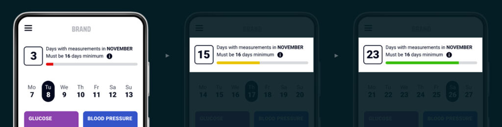
⫸ The problem was that the patients would fail to make the required number of measurements due to various reasons.
⫸ The challenge is informing and engaging patients to take a certain amount of days with measurements every month.
⫸ The solution is adding the counter of days with measurements on the top of the main screen.
This idea, together with rapid sketches, was offered to stakeholders. It was unanimously approved.
Next, the idea was discussed with the company attorney (Rules complainer) to avoid issues when sending incorrect messages to end patients.
After that, we created a counter design and ran A/B testing to choose the best variant.
The counter shows the number of days with measurements and the loading bar. The loading bar is divided into red, yellow, and green.
- The loading bar is red when users begin taking their monthly tests.
- It turns yellow when users are close to getting the required amount of days with measurements in the month.
- Finally, the loading bar turns green when the user has already reached the required amount of days with measurements for the month.
4/4 UI design
the app before and after Redesign
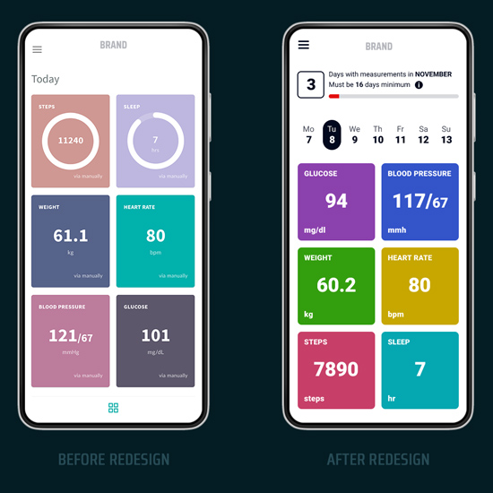
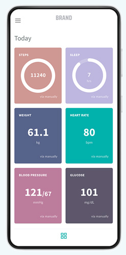
#1 Main screen
It’s the first thing that a user sees when opening the app. The page contains the user’s vital tests for today.
Before redesign
⫸ There’s no information zone/engagement (a measurement counter and a calendar).
⫸ The blocks are placed irrationally:
— less important blocks are placed first (steps, sleeps).
— the most important blocks (blood pressure and glucose) are somehow at the bottom of the page and require scrolling.
⫸ Color scheme and font size are applied, not following the design requirements for older people: bleak background for main blocks with small white font is hard to read for old people.
⫸ Extra non-necessary squares on a white background, fixed at the bottom of the app, take space, confuse users and do nothing.
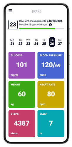
After redesign
⫸ There’s an information zone/engagement: a counter of the number of days that the measurements were done and a calendar.
⫸ Blocks are logically placed.
— most important blocks are moved to the top of the page (blood pressure and glucose).
— less important blocks are moved down the page (steps, sleeps).
⫸ The color scheme and font size are chosen according to general requirements for older app users: bright colors for blocks’ backgrounds with texts in a big font that is very easy-to-read for older people.
⫸ Unnecessary elements are removed.
⫸ Screen space is used correctly: all blocks are compact, fitting one mobile screen completely.
⫸ Moreover, in the new design, we managed to add more necessary elements than in the old design.
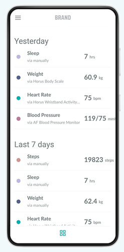
#2 Second screen
The second screen shows the bottom of the main page. It displays vital tests for yesterday and the past 7 days.
Before redesign
⫸ Incorrect font layout: numbers and measurement type are placed in the same line. That’s why measurement types do not fit on a page.
⫸ Font size and color are chosen disregarding the requirements for design for older people: bleak, grey font colors are hard-to-read for old people.
⫸ Extra non-necessary squares on a white background, fixed at the bottom of the app, take space, confuse users and do nothing.
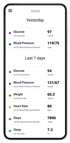
After redesign
⫸ Smart font’s layout: numbers and measurement type are placed in two lines. So all texts fit on a page.
⫸ Font size and color are chosen according to the requirements for design for older people – bold, dark and contrasting.
⫸ Unnecessary elements are removed.
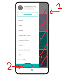
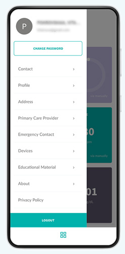
Before redesign
⫸ A space for user avatar. As the app functionality does not allow to add an avatar image, we only see a grey circle which takes a lot of space.
⫸ As a result of it, the name and last name, and e-mail do not fit the screen and go beyond it.
⫸ The font color is light grey, hard-to-read for older people.
⫸ The right dark screen part is inactive to close the menu.
⫸ Wrong placement for buttons “Logout” and “Change password.”
⫸ Confusing main menu layout.
⫸ Extra non-necessary squares on a white background, fixed at the bottom of the app, take space, confuse users and do nothing.
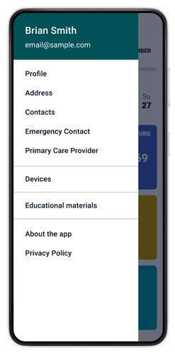
After redesign
⫸ The grey circle for the avatar is removed. The space is cleared.
⫸ As a result, all name types and e-mails (even long ones) fit the screen.
⫸ Font color is dark, contrasting, easy-to-read for older people.
⫸ “Logout” and “Change password” buttons are moved to a special sub-section to exclude accidental pushing by users and logout.
⫸ Bugs in the main menu usability are only a sample. The full list of UX design recommendations was sent to a client and cannot be published due to NDA.
⫸ The main menu points were organized due to their functions.
Summary
Overall, our efforts helped to increase the number of measurements taken by end-users, which in turn led to increased revenue for the company. By solving the problems of insufficient process education and motivation, we were able to help the client achieve their business goals and improve the overall user experience for their customers.