UX/UI design
RPM CRM
Field: Healthcare
Platform: Web CRM
Role: UX/UI designer
Format: Pixel-perfect wireframe
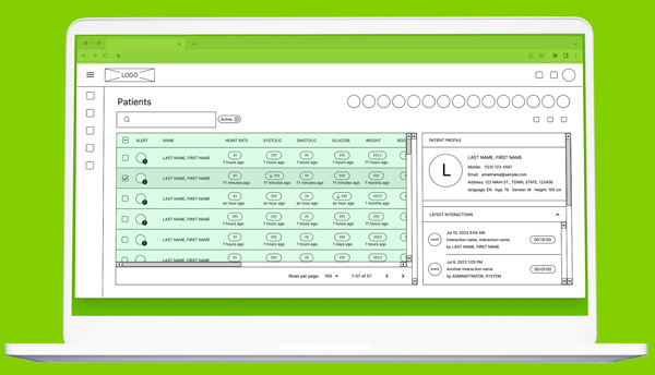
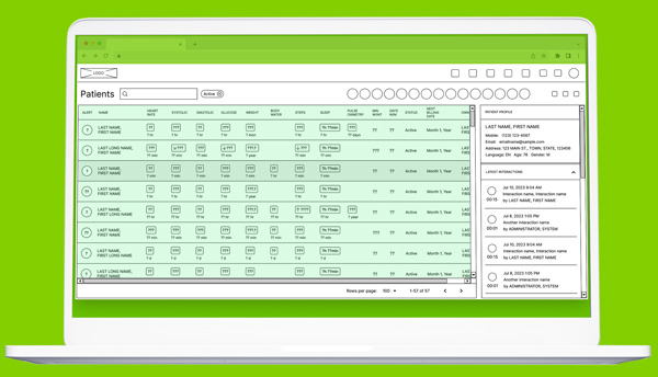
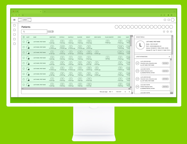
CRM UI BEFORE REDESIGN
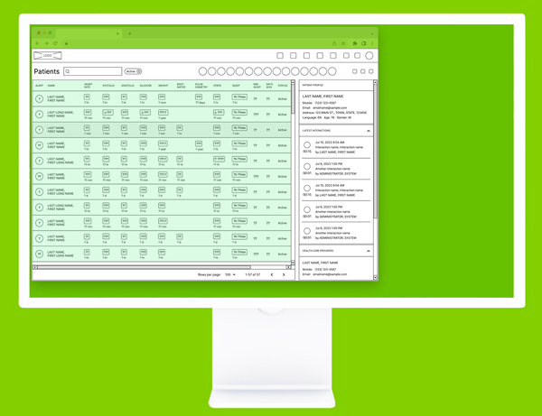
CRM UI AFTER REDESIGN
Field — Remote Patient Monitoring (RPM), Healthcare
Client — The company provides remote healthcare monitoring software and services
Due to NDA, we cannot share the company name and some product details
Platform — Web CRM
Role — UX/UI designer
Format — Pixel-perfect wireframe
RPM CRM
Our task
Improve user experience when working with the CRM in question to increase work effectiveness:
Problem
Every day CRM admin works with an extensive list of patients and a vast amount of alerts for each of them. The problem is that the working area of this CRM system that displays the lists is very small in relation to the whole screen. This leads to unnecessary horizontal and vertical scrolling of that area.
Why does this happen? The fact is that CRM is not optimized for laptop screens (as well as middle-size monitors), which are widely used by many staff members these days.
We also noted multiple usability bugs and unusable user flow inside the CRM system.
As a result, users need to make a lot of unnecessary actions and clicks while working with this CRM. This slows down company productivity overall, affects the company’s revenue growth levels, and frustrates staff influencing their mood and vision.
Research methods
Key findings
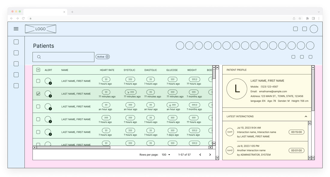
GREEN
The main working window of CRM with a long list of patients, important client data, and everyday alerts from Remote Patient Monitoring (RPM) Devices.
That window is too small and requires constant vertical and horizontal scrolling. For example, it’s necessary to scroll horizontally twice to see current patient alerts. This action may hurt a person’s eyesight a lot.
The reasons are:
1] An outdated layout and irrational use of space in initial CRM.
2] Inconvenient placement of the elements inside the window:
a] The fonts and spaces between texts are not optimized and take up a lot of extra screen space.
— For instance, the Name and Last name fields are written in one line though the amount of space allows to place them into two lines.
— An extra word “ago” was added under each alert, next to timelines (e.x. 2 hours ago). b] It’s logically correct to say (2 hours).
c] The column with checkboxes is not necessary.
d] There is an extra scrolling option.
YELLOW
Detailed information on each patient (including the list of last interactions) is a second important window for staff managers.
This window has an irrational arrangement of design elements that take up too much space on a screen (texts, icons, date/time parameters, etc.). That extra space could have been optimized and used wisely.
There are also extra elements not even used in CRM but are taking space: a large circle with the first letter of the patient’s last name and extra scrolling.
BLUE
Our research showed that 90% of all elements in the blue area are not used in everyday work. At the same time, they take up too much extra space on the screen, making the main working window (green) too small for effective and comfortable work.
PINK
Unused space
CRM UI BEFORE REDESIGN
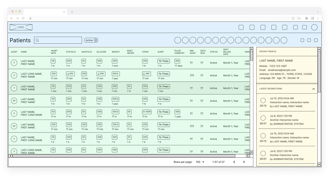
SOLUTION
GREEN
In a new suggested UI the main working window with a list of patients and their alerts is designed according to main design principles, compactly and concisely. The screen now fits ALL alerts and important data. This window does not require horizontal scrolling now.
YELLOW
In a new UI, the window for each patient with his/her data is re-designed to be more compact and user-friendly. In addition, it fits more data about patients’ last interactions.
BLUE
Page navigation tools and other service buttons are placed correctly to save space and be available anytime. This frees the maximum amount of space for main working windows leaving the buttons’ sizes the same.
PINK
We removed that unused space.
CRM UI AFTER REDESIGN
CRM UI before redesign — on a Laptop
CRM UI after redesign — on a Laptop
CRM UI before redesign — on a Monitor
The old design did not fit even on a monitor screen. A user had to scroll the main working window (green) almost twice horizontally.
CRM UI after redesign — on a Monitor
The new design fits the screen completely (all patient alerts and other important data without a need to scroll) and leaves free screen space for other apps like Notes or Jabber.
Outcomes
As a result, we created user-friendly interfaces inside the CRM for every staff member to optimize their work and save time while working with patients. We studied how managers interacted with CRM pages and where the stumbling blocks were. We also used this CRM to determine navigation and usability issues, bugs, and setbacks.
Using all the research data, we created high-quality pixel-perfect wireframes with new layouts that utilize all computer screen space for better productivity and client management. New UI changes removed unnecessary elements and adjusted the display of all measurements and alerts. That is extremely important to managers for work productivity and personal health. For the company, this means more happy clients and revenue growth.