UX research
Udacity Classroom
— how to improve the
learning experience
Platform: Web
Role: UX researcher
Tools:

The project was created during the Udacity
User Experience Nanodegree, 2021 course.
Udacity is a global, online, lifelong learning platform connecting education to jobs. Udacity works with industry leaders to create project-based online learning programs. These unique collaborations ensure that students learn the technical skills that employers value.
100k+
Udacity graduations
and counting
200+
Industry experts partnering
to build our content
160
Students learning in
over 160 countries
100+
Enterprise customers
world-wide
1/7 Project summary
Platform: Web
Role: UX researcher
The site we worked with: classroom.udacity.com/me — the classroom is Udacity’s learning website.
UDACITY CLASSROOM — HOW TO IMPROVE
THE LEARNING EXPERIENCE
It is the first project from the series of Udacity-based projects. It is focused on gathering and analyzing data about possible website usability improvements and suggestions for a seamless learning user experience. This project version is a mastered version of an educational project, which I finalized after graduating from a design course for my portfolio site.
The project was developed in 2021. So the research was based on the design and usability of a Classroom website and other connected sites that were actually in 2021. Though this project was educational, several developments of my research were quickly implemented by Udacidy developers. In addition, some suggested usability improvements were made to Udacity Classroom.
PROJECT OVERVIEW
While studying the course “User Experience Nanodegree” 2021 at the Udacity platform, I faced difficulties using the Classroom website and other branches. I suggested that other students have the same pain points as me. Then using my vast experience in web development and new UX design knowledge, I decided to do a UX/LX design project based on Udacity. So I got all necessary permissions from Udacity administration and started my UX research.
PROBLEM STATEMENT
This research aims to find the best solution to make Udacity classroom site navigation convenient, make the learning process visual, identify usability bugs, and improve overall site conversion.
PROJECT SCOPE
As a result, we have identified the reasons for those design issues stated below by applying Design Sprint methods. Then we created a list of recommendations to improve Classroom website usability. Some of them were immediately implemented by Udacity developers.
RESEARCH METHODS
— Usability expert review
— A/b survey
— Semi-structured interview
— Looking at the industry
— Feedback collection
DISCLAIMER
Udacity logotype and other elements of Udacity branding are the property of Udacity. They are used in this presentation with the permission of the Udacity administration within my education project work. This project was created while studying in the course “User Experience Nanodegree,” 2021.
EXPLORING THE PROBLEMS
#1
For example, the block “Pick up where you left off” on the main page of each course, for some reason, always leads to a last watched lesson and not to a last finished one. 100% of surveyed students voted for changing the block to lead to the last completed lesson. The Udacity development team made that change very quickly. See details in “Key findings.”
#2
Difficulties in understanding the educational process.
Each educational course contains tons of information. Some have multi-level structures, and it is hard to perceive their hierarchy at once (for example, the course “User Experience Nanodegree” had 4 levels). But unfortunately, the curriculum did NOT have a visual of categories and sub-categories of lessons, and as a result, there was NO means to see the learning progress. This confused students. They could not see how many course blocks they had finished and how many were left.
The second [ UX/LX/UI DESIGN ] project based on Udacity
Follow the link to study detailed research on Udacity classroom curriculum menu redesign about Classroom navigation issues, curriculum menu redesign, and left menu redesign of a Udacity classroom website.
#3
The issue was that the design of a Classroom does not visually differentiate the links leading to inner pages and those leading to related websites. Moreover, several associated websites have a similar design and a left menu, and some look completely different. In addition, some sites open in the same tab, and some open in a new browser tab. In most cases, a student cannot get back to the course after going to related websites. They are practically stuck and cannot navigate back to previous pages.
#4
If users cannot identify if they are on the main website or left it, and if they cannot navigate back to the pages they came from using site navigation tools, it signifies a massive issue in UI/UX.
#5
Usability bugs in the classroom website.
The classroom website is an example where all design usability rules and guidelines were violated. For example, there are duplicate headers that did not correspond and sometimes were even contradicting menu items on Classroom pages. Also, some buttons are active only when a certain menu layout is on.
2/7 Research methods
USABILITY EXPERT REVIEW
This is the first stage of our research. It was reviewed by a specialist with 15+ years of experience in the design, development, and project management industries.
During the Usability expert review of all pages of Udacity Classroom from a UX/UI standpoint we:
— Analyzed usage convenience, readability, and clarity of the left menu of Classroom (curriculum menu and additional menu)
— Analyzed the rest inner navigation tools of the classroom website (User flow and site map)
— Analyzed UI regarding pages’ design for Classroom and their layout according to main design principles.
— Analyzed navigation for other Udacity-related websites connected to the main Classroom website.
A/B SURVEY
Based on the data discovered at the first stage of our UX research (Usability expert review), we made a list of questions concerning certain moments of UX and UI of the сlassroom website and related websites of the Udacity project. We also included several iterations in-between to collect feedback from other students of the Udacity platform. We discovered a lot of quality Key findings which helped us see the exact pain points in website usability. We identified the most critical drawbacks in UX (voted by the target group). The issues were easy to fix, and the exact instructions were sent directly to the Udacity development team. The results of A/B Surviving prompted the necessity of deeper study by Semi-structured interview.
SEMI-STRUCTURED INTERVIEW
We conducted our interview in two ways: in person and by video call. The questions of the interview can be divided into three parts:
1] First – in the warm-up, we met the students and their experience using Udacity.
2] Then, we inquired about their previous experience using other educational platforms. We did it to compare the user experience at Udacity and their competitors.
3] The next step was computer work. At a personal meeting, we worked together on a laptop. The students showed us how they work with the Classroom website. When we conducted video interviews, they were sharing their screens. The students were answering particular questions about Usability and site navigation, showing us how they work with the website in reality.
LOOKING AT THE INDUSTRY
To do our best, we studied the experience of our competitors: how the information is offered on the pages, user flow, and system navigation inside the sites and within site blocks of the same project. The competitive analysis gave us an insight into how other companies improve their platforms to attract more students and retain them. The competitive analysis can be divided into 1] Competitors analysis, studying other educational platforms. 2] Review of informational platforms.
FEEDBACK COLLECTION
Collecting feedback from Udacity students was an essential step of our research. We found out their opinion about navigation, pain points, and suggestions to improve the workflow of a current Classroom website. We found out that students had many issues with the system. We were collecting feedback continuously while conducting Semi-structured interviews and A/B surveys, which helped us observe the topics from various standpoints. The user feedback partially confirmed our suggestions and partially disproved them. Overall we got a lot of valuable data for analysis and implementation.
3/7 Target audience
We singled out three groups of Udacity students for A/B surviving and Semi-structured interviews. Our goal was to get feedback from people who are new to the system and, at the same time to see what long-time students think too. We concluded that bad usability is primarily a problem for first-time users. The two first categories from above were frustrated with usability the most and voiced their pain points. Interestingly, many pain points matched both new users and long-timers. These key findings were included in the first urgent development list for Classroom.
0 – 1 month
New students who just started classes at Udacity (no more than a month). We registered their first impression from the classroom website and related sites’ usage. They showed us major pain points in site navigation and usability.
1 – 3 months
Udacity students who have been using the platform for up to 3 months. They were somewhat used to site navigation but were still bothered by the navigation issues.
3+ months
The third group is students who have used the platform for a long time already (more than three months). Those students were already used to the navigation, which did not bother them too much.
4/7 Key Findings
We created a list of features that need to be improved while doing a design review. Unfortunately, we cannot provide a list of them due to NDA. That’s why we will give only some final suggestions of UX/UI expertise. We will also provide the Key findings referred to the classroom website, some of which were added to actual development lists of Udacity developers. Other key findings and conclusions will become the base of further design research in different presentations.
#1
Link “Pick up where you left off”
This issue is a very painful point for every student. On each program’s homepage, there are a lot of information blocks containing various links to the inner parts of the course. One of those blocks is called “Pick up where you left off.” In the original site version, that link leads to the last viewed section of an educational course. It was very inconvenient for all students. All participants of the A/B survey suggested that it would be good that the link “Pick up where you left off” leads to the point where they left off their education course, i.e. to the last finished lesson.
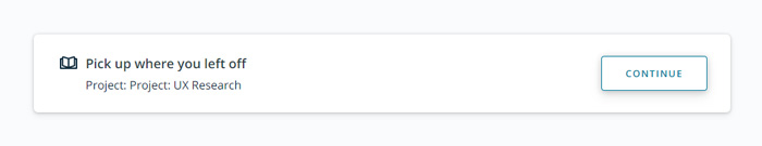
100%
of the participants responded that they prefer
the link “Pick up where you left off” to take them to the last completed page – the page when they stopped their education.
This finding was immediately transferred to the Udacity development department, and the classroom website updates were made. Many students were delighted; they could study more effectively and at a faster pace!
#2
The upper part of the left menu of the site previously contained a logical error:
— The blue arrow is the link which sends back.
— ‘Submit your project’ was a title that was irrelevant to this page. And was not a link to submitting the project page.
Thanks to our research, this UI issue has now been fixed. Nowadays, the top of the left menu contains one link leading to the upper directory.
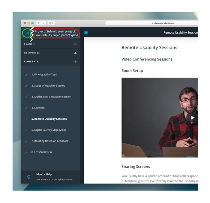
This finding was immediately transferred to the Udacity development department, and the classroom website updates were made. Many students were delighted; they could study more effectively and at a faster pace!
#3
One of the significant bugs discovered during the usability review process was the “Home” button in the left menu of the website. It did not work when the menu was opened. So the students had to close the menu, press the closing icon and then press the Home button. It was inconvenient and frustrating.
Due to NDA agreements, we cannot provide a complete list of bugs discovered during our research here.
#4
The Classroom website’s design violates many well-known and standard web design principles: the headlines must correspond to the menu items. As a result, one can find headlines on inner pages that contradict each other. We are offering those screenshots as an example.
Due to NDA agreements, we cannot provide a complete list of web design principle violations discovered during our research here. So instead, we will focus on some items from the list.
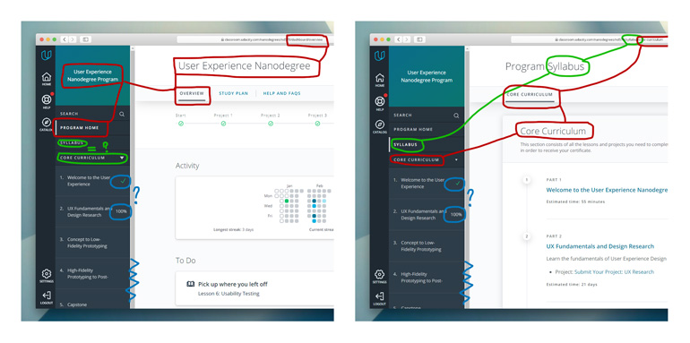
#5
One fundamental web design principle is that the menu should look the same on all website pages regarding navigation and usability principles, predictability, and convenience. Unfortunately, the current website version violates all of them: the left menu design varies on different inner pages of the website. As a result, there are severe issues: inconvenient navigation, difficulty identifying user location inside site pages, and, most importantly, trouble understanding how the educational process goes.
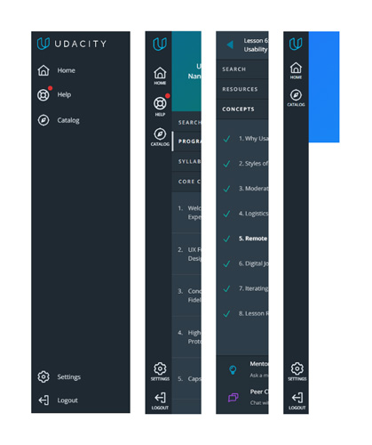
The second [ UX/LX/UI DESIGN ] project based on Udacity
This problem led to creating a separate project. You can see a detailed review of the Classroom left [curriclum] menu and its issues at Udacity classroom curriculum menu redesign. Follow the link to read the full report.
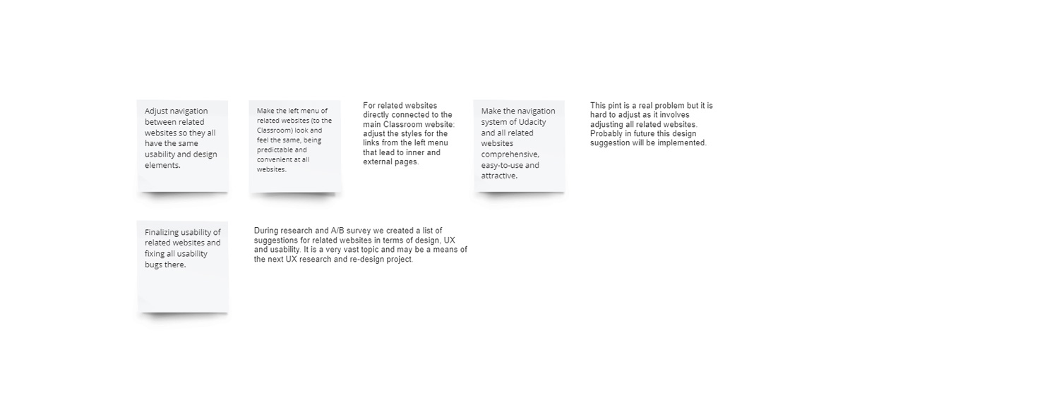
#6
This point is closely connected with previous UI issues. The pain point is that the current design of the classroom website does not differentiate between the links that lead to inner site pages and to related sites. Moreover, some classroom-related websites have a similar website and left menu designs, and others look completely different. Some associated websites open in the same tab, others in new browser tabs. In most cases, a student cannot get back to the educational course after transferring to related websites. This leads to navigation issues between the main classroom website and other classroom-related sites. This point is a real problem, but it is hard to adjust as it involves adjusting all related websites. Probably in the future, this redesign suggestion will be implemented.
100%
of surveyed people wished the navigation system was the same for the classroom site and related websites
5/7 Feature prioritization
CLASSROOM WEBSITE
6/7 Recommendations
1] Adjust a link “Pick up where you left off” leading to the last finished educational block.
2] Fix usability issues on main Classroom pages
3] Make the left menu look the same on all classroom website inner pages, including all lesson pages.
4] Make the left menu look the same on all related websites, which look like the classroom website.
5] Fix several usability bugs.
7/7 Outcomes
We have run a broad spectrum of design research procedures (UX review, A/B surveys, competitors study) for the Udacity website, Classroom, and some classroom-related websites that are directly linked to the educational process at the platform. As a result, we identified the key pain points and bugs in design and usability. A list of the Key findings that included the opinion of our target study group (students of various levels) was provided. Most critical UX/UI design suggestions went directly to the Udacity development team and were immediately implemented as they were crucial issues. After our work, the Classroom website pages became more attractive for new students; the education workflow was more transparent and comprehensive. The students of all levels identified their pain points and were very satisfied with their unique user experience when the issues were fixed. We used the best UX/LX/UI design practices to adjust the website pages and increase user retention and satisfaction. My thorough work on the website design was praised by my mentors and the Udacity development team. Here’s what we could identify and suggest for this project:
01
A lot of work on design research and testing was done during the process. We conducted students’ interviews, watched them using the website pages, collected their feedback, and created questionnaires.
02
We got measurable results that covered the opinion of several categories of site users (first-timers, experienced users, and teachers). The suggestions were a better site navigation layout for left menus of the main site and related sites, fully functional buttons (in critical locations), and noticeable logical links that lead to the correct pages.
03
We successfully set and solved the following tasks: created “Feature Prioritization / Redesign Plan,” which answered the company capacity and students’ pain points; made the Curriculum navigation convenient and increased students’ success by redesigning the workflow of a study process; All of it made the educational progress clear, understandable and attractive for new teachers/students. Traffic on the platform increased.
04
We created a list of key findings and detailed recommendations for a development team.
05
Identified future research directions and areas where UX/LX/UI design is needed shortly to increase conversions and improve user experience. Our detailed and quality work was highly professional, and all necessary reports were provided to the Udacity team for review and implementation. The team highly praised our key findings and improvement instructions, and some of our suggestions were implemented immediately, so we consider this project a success. The Udacity site became a more attractive and convenient platform for online education. Usability adjustments were a big, game-changing event for them.