UX/UI design

Platform: Web
Role: UX/UI designer
Tools:

The project was created during the Udacity
User Experience Nanodegree, 2021 course.
Udacity is a global, online, lifelong learning platform connecting education to jobs. Udacity works with industry leaders to create project-based online learning programs. These unique collaborations ensure that students learn the technical skills that employers value.
100k+
Udacity graduations
and counting
200+
Industry experts partnering
to build our content
160
Students learning in
over 160 countries
100+
Enterprise customers
world-wide
1/11 Project summary
Platform: Web
Role: UX/UI designer
The site we worked with: classroom.udacity.com/me — the classroom is Udacity’s learning website.
It is the second of the two Udacity projects. It is focused on a left menu design for Classroom of Udacity educational portal. We reviewed the navigation system of the Classroom website and focused on the curriculum menu as it had the most significant issue. This project is a finalized version of an educational work I finished after the course. The project was developed in 2021, which is why all the data used is from Classroom look in 2021.
PROJECT OVERVIEW
While studying in a course called “User Experience Nanodegree” on the Udacity platform, I found some issues with Classroom site navigation, particularly in identifying my position at a website and in educational process understanding. I suggested that other students also experience the same difficulties as me. Then I decided to use my experience in web development and my knowledge in UX and create my UX/LX/UI project based on Udacity. I acquired all necessary permissions from the Udacity administration and started my research.
The first [ UX/LX RESEARCH ] project based on Udacity
Navigating the classroom curriculum is a case of the global problem of navigating the Classroom and related websites. The comprehensive research about navigating the classroom and associated websites, the list of critical findings, feature prioritization, and usability upgrades recommendations can be viewed in the project Udacity classroom — how to improve the learning experience.
DISCLAIMER
Udacity logotype and other elements of Udacity branding are the property of Udacity. They are used in this presentation with the permission of the Udacity administration within education project work. This project was created while studying in the course “User Experience Nanodegree”, 2021.
EXPLORING THE PROBLEM
Convenient navigation Curriculum and visibility of the learning progress are necessary conditions for comfortable learning. Unfortunately, research has shown that students experience difficulty navigating the curriculum, determining their location in the classroom, and understanding their learning progress.
The current version of the Udacity classroom’s curriculum menu does not demonstrate all sections and subsections of each curriculum. Because of this, it is unclear:
— How many lessons have already been completed?
— How many lessons remain?
As a result, students are unable to gauge their progress.
The related problem is that students have to return to the main menu to move between different curriculum sections. Numerous movements back and forth lead to students being lost and unable to determine their location.
PROBLEM STATEMENT
The project’s goals are to improve students’ user experience interacting with the Udacity classroom website and solve two significant problems:
— First, make the educational progress clear and understandable.
— Second, make the navigation curriculum convenient.
PROJECT SCOPE
Our goals were: Review the left menu design and its current usability and identify navigation issues and critical features needed for Classroom students to use the system more effectively. We conducted a UX study and provided prototypes for the left (Curriculum) menu, website blocks, and breadcrumbs. We collected user feedback and created a professional list of key findings and suggestions for better website usability to send to the Udacity development team.
RESEARCH METHODS
Usability analysis, usability review, look-back testing. We have discussed the research process in the project Udacity classroom — to improve the learning experience.
2/11 USABILITY ANALYSIS
OVERVIEW
The first stage of the study is the usability analysis of the curriculum menu on the existing classroom website. Udacity courses use multiple categorized directories in navigation. Therefore, we choose the Udacity “User Experience Nanodegree” course with four levels in the curriculum menu for this research. Using the example of this course, we analyzed the usability of the existing curriculum menu of the classroom website, worked out a sitemap, and user flow, created sketches and prototypes, and conducted user testing.
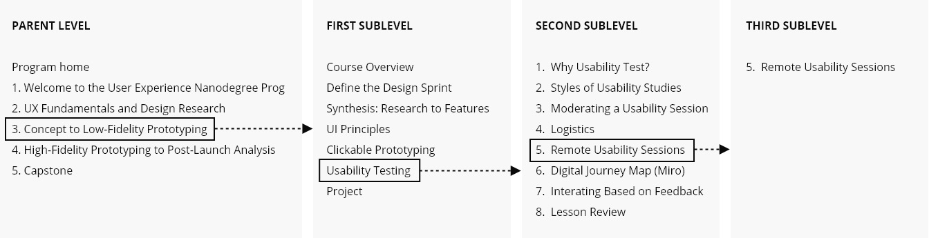
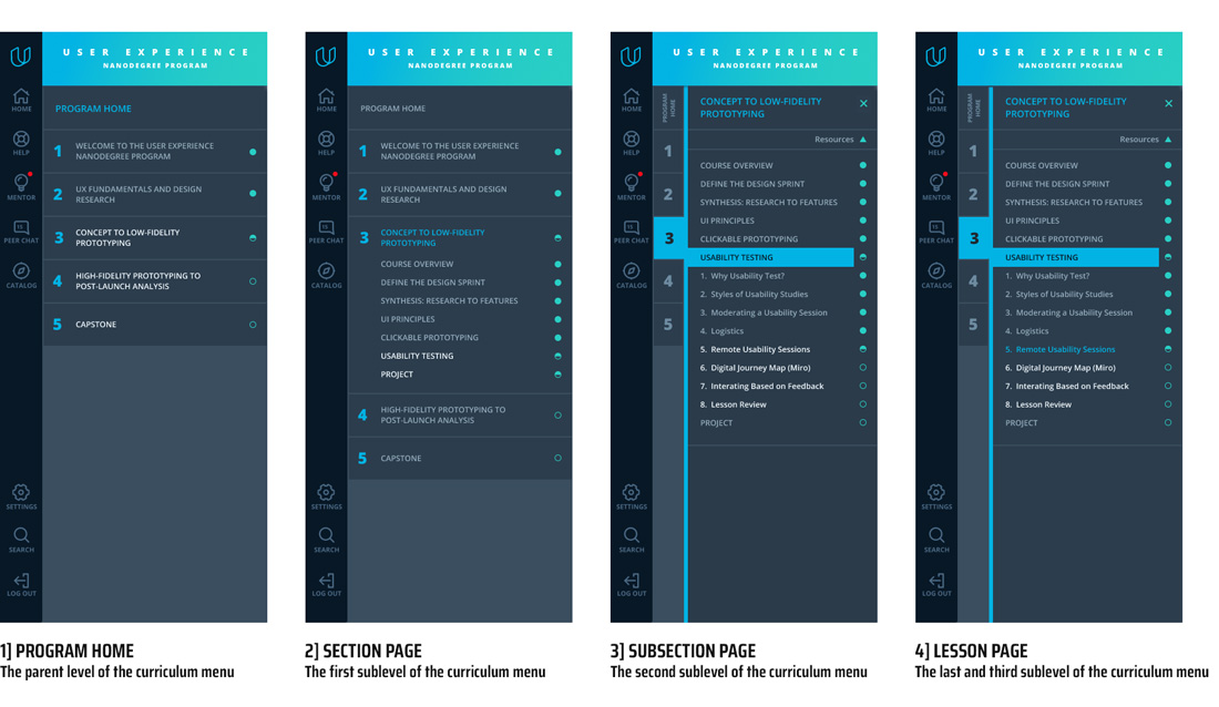
— SITE MAP
First, we created a brief site map of the existing Udacity “User Experience Nanodegree” curriculum menu. The menu includes four levels of categorized directories. The Parent level of the menu contains a link to the main page – Program home and five central curriculum directories. The menu First sublevel and second sublevel consistently include the first and second levels of categorized directories. The third and last sublevel is the lesson page.
— USER FLOW
We created the first user flow based on the existing “User Experience Nanodegree” curriculum menu.
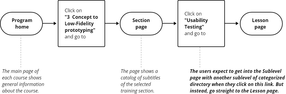
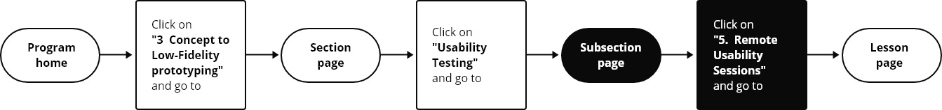
The main page of each course shows general information. Then, by clicking on one of the central curriculum directories (in this case, on “3 Concept to Low-Fidelity prototyping”), the user goes to the Section page, which demonstrates the first sublevel of the curriculum menu and the catalog of the subtitles of the selected central training section. However, by clicking on one of the curriculum menu sublevels (in this case, on “Usability Testing”), the user expects to go to the second Subsection page with the list of subtitles associated with the topic “Usability Testing” and with the list of the third menu sublevels. But instead, the user goes directly to the last viewed Lesson page, where the curriculum menu looks different from the previous two pages and demonstrates second sublevel menu items. And that isn’t very clear. So, we added another missing Subsection page and additional action (in this case, click on “5. Remote Usability Sessions”) to the user flow to fix this flaw. The new user flow will be used when creating sketches, designs, and prototypes of the new curriculum menu.
3/11 USABILITY REVIEW
We analyzed the usability of the curriculum menu of three existing Udacity Classroom webpages based on the Udacity “User Experience Nanodegree”: Program home, Section page, and Lesson page. The entire navigation system of the classroom is considered in the project Udacity classroom — to improve the learning experience.
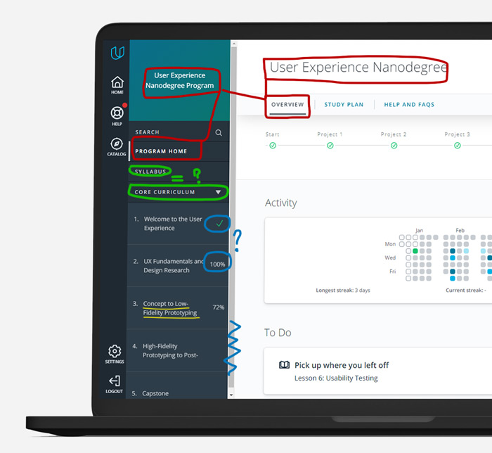
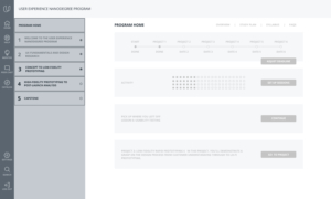
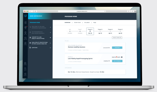
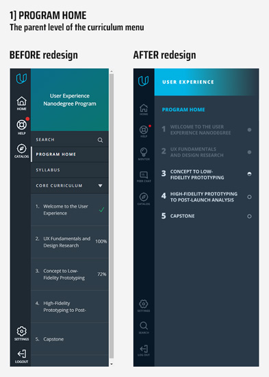
1] PROGRAM HOME
The main page of each course shows general information about the course
We want to consider some usability points that we’ll focus on in future design updates:
1] The existing curriculum menu design uses the screen space irrationally. Due to the unnecessarily large menu title “User Experience Nanodegree program” and intervals between menu elements, placing the correct number of menu items on one screen is impossible without scrolling.
Looking ahead, we should say that unnecessary scrolling is used in all sections of the curriculum menu on all web pages. Scrolling is used even on those web pages where the number of menu items fits on the screen without scrolling.
2] The web page headlines do not correspond with the menu item. As a result, one can find headlines on inner pages that contradict each other.
3] The menu is oversaturated with elements that do not have a visual hierarchy.
4] The education progress is unclear: green checkmark or grey 100%. In some cases, grey circles or stars marked viewed pages.
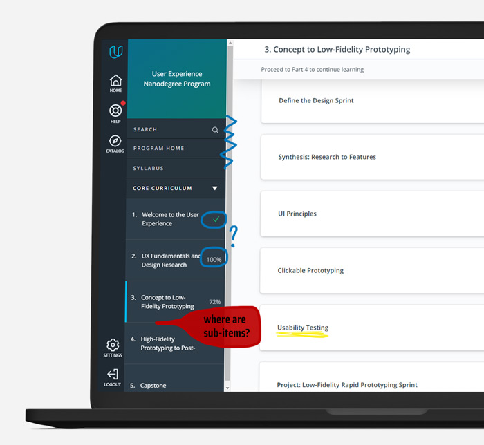
A click on one of the central curriculum directories (in this case, on “3 Concept to Low-Fidelity prototyping”) leads a user to the Section page ⫸
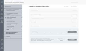
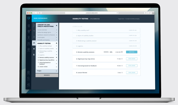
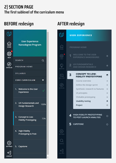
2] SECTION PAGE
1] There are the same issues with UI as we discussed above [the screen space, scrolling, titles, and educational progress marks].
2] And the most important: the sub-items list in the curriculum menu are missed. The curriculum menu on the current web page shows the headings of the leading training sections, the same as on the main page. However, as we can see, the list of curriculum sub-items does not open.
A click on one of the curriculum menu sublevels (in this case, on “Usability Testing”) leads the user to the last viewed Lesson page instead of the expected Subsection page ⫸
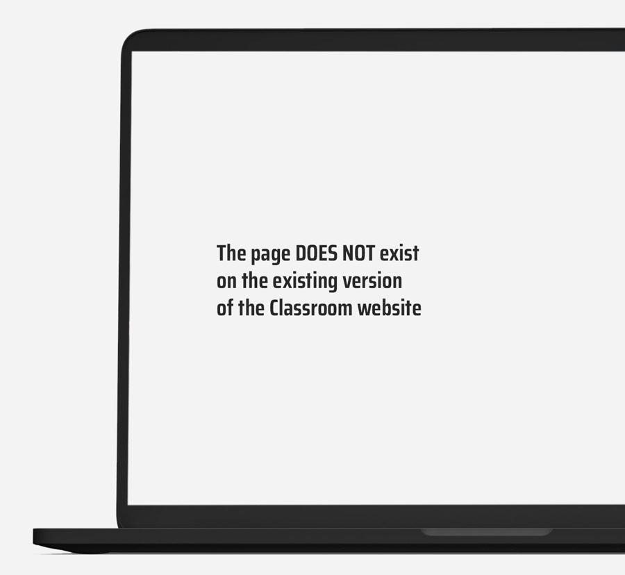
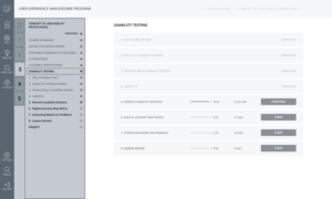
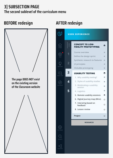
3] SUBSECTION PAGE
The page DOES NOT exist on the existing version of the Classroom website but is added in the redesigned version.
The potential Subsection page should demonstrate the second sublevel of the curriculum menu and the catalog of the lessons of the selected sublevel of the training section.
This leads to a poor navigation experience. On one side, students cannot visualize the scope of work they need to do. On the other side, students may miss some critical information about the study process.
A potential click on one of the lessons (in this case, on “Remote usability sessions”) in the curriculum menu or on the main field of the web page must lead the user to the webpage with the last finished Lesson. We have implemented this feature in the new design of the curriculum menu of the Classroom ⫸
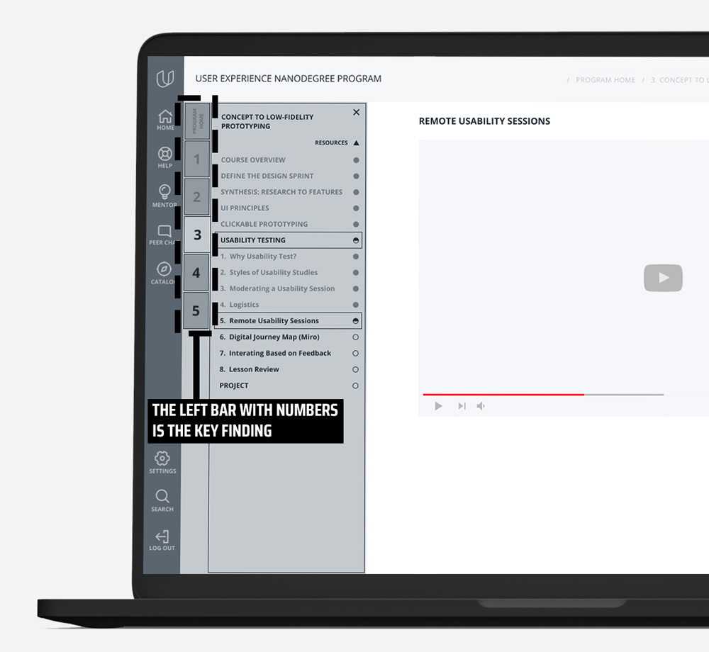
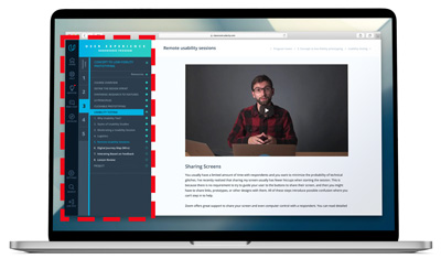
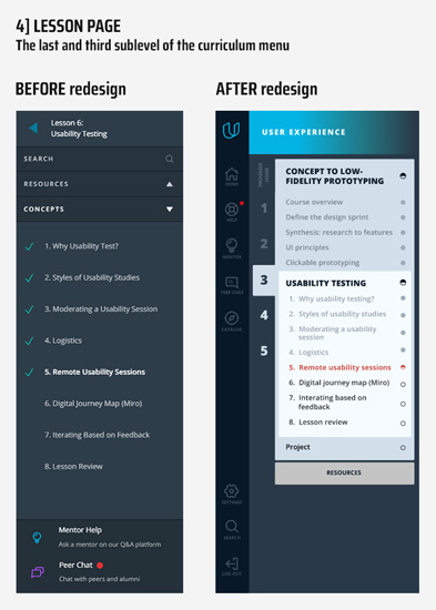
4] Lesson page
The page demonstrates specific training material
1] The left menu is different on this classroom webpage.
In our opinion, the most extensive UI issue of the classroom website violates one fundamental web design principle: the menu should look the same on all website pages regarding navigation and usability principles, predictability, and convenience. Unfortunately, the current website version violates all of them: the left menu design varies on different inner pages of the website.
2] Also, the current version of the Udacity classroom’s curriculum menu does not demonstrate all sections and subsections of the curriculum. Because of this, it is unclear:
— How many lessons have already been completed?
— How many lessons remain?
As a result, students are unable to gauge their progress.
3] The related problem is that students have to return to the main menu to move between different curriculum sections. Numerous movements back and forth lead to students being lost and unable to determine their location.
4] The upper part of the left menu of the site previously contained a UI error:
— The blue arrow is the link which sends back.
— ‘Submit your project’ was a title that was irrelevant to this page. And was not a link to submitting the project page.
This is one of the Key findings researched in the project Udacity classroom — how to improve the learning experience. This finding was immediately transferred to the Udacity development department, and this UI issue has now been fixed.

4/11 Key findings
We summarized the UX Review’s findings on the Udacity Classroom Curriculum menu and compiled a list of key findings.
1
The existing curriculum menu does not follow must-know principles of website navigation menu design: Consistency, Easy to find, Easy to operate. Consistency is the most crucial principle in navigation menu design. All web pages must have the same model of the navigation menu. Unfortunately, the existing version of the Udacity Classroom website has different models of the left [curriculum] menu on various web pages. This makes it challenging to navigate between Classroom pages. It’s also hard to determine user location on the website.
2
Because of this, it is unclear how many lessons have already been completed and how many lessons remain. And as a result, students do not see their educational progress. It is the most important finding. The related problem is that students must return to the main menu to move between different curriculum sections. Numerous movements back and forth also make students feel lost and unable to determine their location on the classroom website.
3
Due to large intervals between menu elements, placing the correct number of menu items on one screen is impossible without scrolling. Unnecessary scrolling is used in all sections of the curriculum menu on all web pages. Scrolling is used even on those web pages where the number of menu items fits the screen without scrolling.
4
The user flow is unorganized
For example, a student is transferred to the last viewed lesson instead of the last completed one.
5
The site map is very confusing
For example, “The Sublevel page” is one of the catalog levels that does not exist on the website (see above).
6
For example, unstable buttons work in some menu positions and do not work in others.
7
The website contains UI bugs
For example, the icons for unfinished / viewed sections and lessons are unclear.
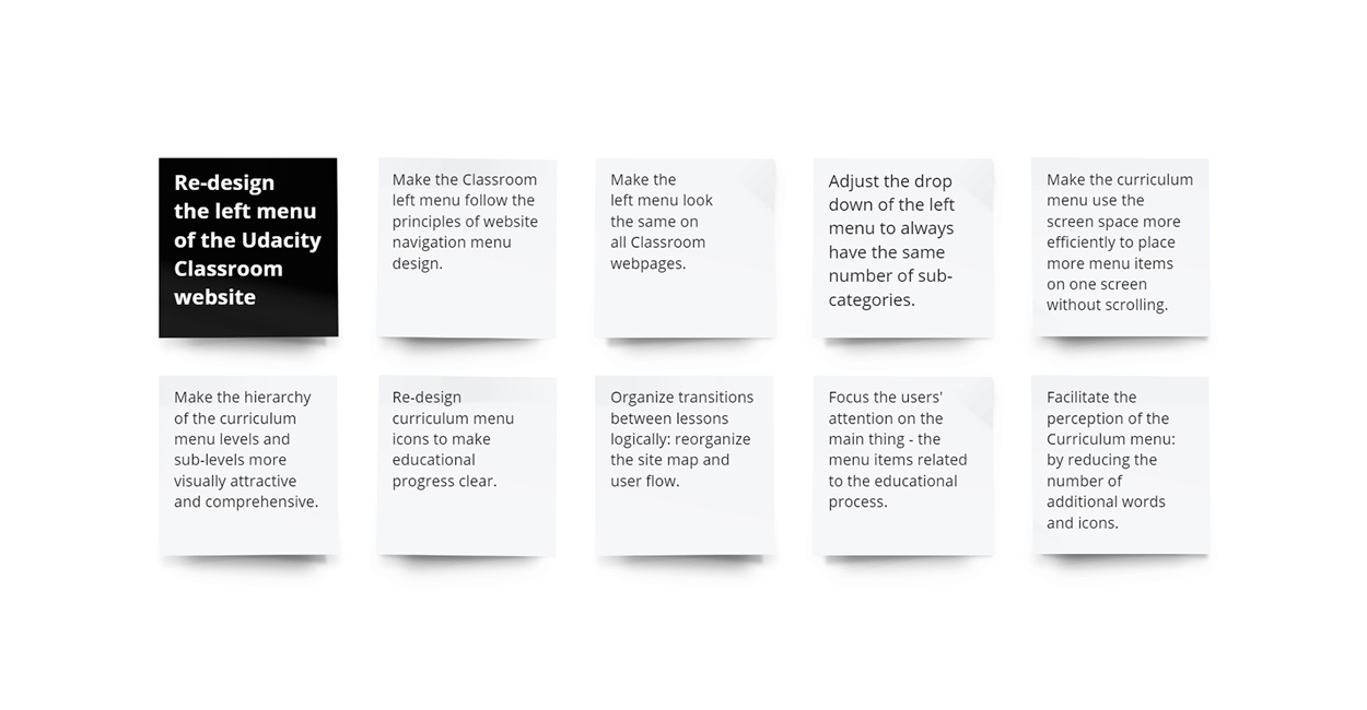
5/11 Feature prioritization
/ redesign plan
Summing it up, we conclude that the Udacity Classroom curriculum menu should be redesigned to improve students’ user experience while interacting with the Udacity classroom website.
The significant problems should be solved:
1] First, make the navigation Curriculum convenient.
2] Second, make the educational progress clear and understandable.
6/11 Solution
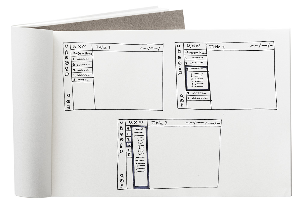
Low-Fidelity wireframe sketches
Design principles are
applied in the sketches
1
2
Precise text-presentation
3
Visible and thought-out site structure
DESIGN WORK PERFORMED
— The curriculum menu was redesigned to make the menu levels and sub-levels look more prominent and accessible.
— The levels and sublevels of the current main section are always displayed on the screen.
— All Icons are moved to the left dark bar, and additional labels are removed.
— The Curriculum menu contains only the names of the levels and sublevels.
— The Curriculum menu uses the screen space efficiently without scrolling.
— The bread-crumbs navigation was added to the webpage header.
The left bar with numbers is the key finding
— The numbers of the curriculum parent levels are always shown on the screen and are clickable like links.
7/11 Low/mid-fidelity prototype
Based on the sketches, design work described above, and the key finding [the left bar with numbers], we created a low/mid-fidelity prototype. It is customary to develop a Low-fidelity prototype at this stage. But as all website elements are known beforehand, we chose a Low/Mid-fidelity style prototype.
VIEW LOW/MID-FIDELITY INTERACTIVE PROTOTYPE IN FIGMA:
The prototype went through the first UX testing with Udacity students
1] The test group highly estimated navigation convenience between categories and sub-categories using the left column with numbers and a transparent section hierarchy.
2] They also highly praised our new horizontal navigation block [bread crumbs], which helped identify user location at a website and move quickly between the sections.
8/11 High-fidelity prototype v.1
Here we will shortly discuss the first version of the curriculum menu redesign. We have tested it with our target users and stakeholders. The study showed that its redesign was too crowded with extra elements. It was too busy, too bright, and destructing from the educational process. That’s why we decided to make an immaculate version that would be easy to understand on a computer screen. You can learn all the details in the next block.
9/11 High-fidelity prototype v.2
1] PROGRAM HOME
The parent level of the curriculum menu. The main page of each course shows general information about the course.
2] SECTION PAGE
The first sublevel of the curriculum menu. The section page demonstrates the first sub-level of the curriculum menu and the catalog of the subtitles of the selected main training section.
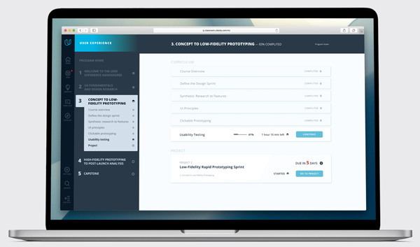
3] SUBSECTION PAGE
The second sublevel of the curriculum menu. The subsection page demonstrates the second sublevel of the curriculum menu and the catalog of the lessons of the selected sublevel of the training section.
VIEW HIGH-FIDELITY INTERACTIVE PROTOTYPE IN FIGMA:
REDESIGN WORK PERFORMED IN HIGH-FIDELITY PROTOTYPE
1
The left bar with numbers [new unique feature]
Numbers of the curriculum parent levels are always shown on the screen and are clickable like links.
2
The left bar with numbers [new unique feature]
— New color coding patterns were suggested to define lessons that are finished and those that are in progress
— The levels and sublevels of the current main section are always displayed on the screen.
— All icons of additional navigation [same as “Search”] were moved to a dark left bar.
— In the curriculum menu, all additional labels are removed.
— The Curriculum menu contains only the names of the levels and sublevels.
— As a result, Curriculum menu items became visible in the main menu. This made system understanding easier for students and saved a lot of screen space for essential design elements.
3
We used several iterations to ensure screen space was used wisely. For example, we made course headlines smaller. We also applied the same setting site-wide. As a result, we could put all catalog items in the left menu and resolve unnecessary scrolling issues.
4
A new icon design was implemented
— An empty circle shows a lesson that hasn’t been started yet [course section].
— Half full circle means that the lesson was started or half done [same for the whole course].
— A full circle shows a finished lesson [course section].
5
It was a perfect solution for a multi-level menu and help students navigate the pages faster.
Our objective in this project did not include a detailed re-design of all website pages. Still, in our sketches, we offered several design usability solutions to display catalogs and courses on the platform.
a. Using screen space effectively: blocks’ height was decreased to fit more of those sections to one screen.
b. Using color differentiation to separate the finished lessons and those that are not.
c. Optimizing the button and font sizes for better usability and navigation. The spaces between lines were also decreased for the same reason.
The lookback testing
We used Lookback.com to conduct UX/LX testing. Respondents highly praised usability in navigation between website sections and sub-sections. They rated high the left column with numbers for its simple and ergonomic design. The numbers allowed new students to understand where they were in the education process, which was helpful. The new appealing design were easy-to-use and comprehended by people of all ages and skills. The test group also mentioned the new horizontal navigation (bread crumbs), which helped them identify their website location and move between various sections.
10/11 Outcomes
01.
In this design project, we studied the Udacity classroom website pages and focused on the left menu structure and outstanding navigation issues.
02.
The results we achieved resolved the critical pain points users had for a while: poor navigation options in the left [curriculum] menu, the need to scroll the menu, irrational use of screen space, and the hard-to-understand educational process.
03.
The following goals were identified and achieved:
— First, make the navigation Curriculum convenient.
— Second, make the educational progress clear and understandable.
04.
The new version of Classroom pages corresponds to all basic design principles. In addition, the new left [curriculum] menu is very easy-to-use and understandable.
11/11 Feedbacks

Naomi P
What I like the most is the menu is part of the page. Because I can see everything. I can see how many topics I have left. What I already went throw and everything.

Michael A
The sidebar is outstanding! It is very convenient and useful for my needs. I was able to learn at a faster pace.

Jose C
I like the fact that I can see everything on one screen without scrolling through the menu. I also use the left menu a lot now, and I love it! I signed up for the next course!

Emery J
I like the fact that I have a left panel with numbers from what’s inside. You know the lesson you’re being taught. Instead, scroll back to see which lesson you are in.

Lillian C
I am a newcomer to the platform. First, it was hard to track my progress in classes. I was happy to see the changes in navigation. It saved a lot of time for me. Thanks a lot!

Daniel S
The breadcrumb menu is good. I did not realize how I missed it until I had it on my pages and was able to move faster through website courses. It is definitely an improvement.